CANVAS BARN
CANVAS BARN
Canvas Barn, we take pride in our commitment to quality craftsmanship. Each of our products is carefully crafted using the finest materials and the highest standards of workmanship to ensure durability.
Research
Informing decision-making: Research provides data and evidence to support design decisions. It helps designers make informed choices about layout, color schemes, typography, and other design elements, leading to more effective and user-friendly websites
Design
Usability and Accessibility: Good design considers the needs and preferences of users, ensuring that the website is easy to navigate and understand. Intuitive navigation, clear hierarchy, and logical organization of content enhance usability and accessibility, allowing users to find what they are looking for quickly and easily
Development
Development optimizes the website's performance by optimizing code, reducing file sizes, and improving loading times. A fast-loading website enhances user experience, reduces bounce rates, and improves search engine rankings
What is Platform?
Who uses platform?
What do I do next?
What is Platform?
Who uses platform?
What do I do next?
Reduced Bounce Rate
Response Rate
Sales Pipeline
Design
Usability and Accessibility: Good design considers the needs and preferences of users, ensuring that the website is easy to navigate and understand. Intuitive navigation, clear hierarchy, and logical organization of content enhance usability and accessibility, allowing users to find what they are looking for quickly and easily
Usability and Accessibility: Good design considers the needs and preferences of users, ensuring that the website is easy to navigate and understand. Intuitive navigation, clear hierarchy, and logical organization of content enhance usability and accessibility, allowing users to find what they are looking for quickly and easily


Development
Development optimizes the website's performance by optimizing code, reducing file sizes, and improving loading times. A fast-loading website enhances user experience, reduces bounce rates, and improves search engine rankings
Development
Development optimizes the website's performance by optimizing code, reducing file sizes, and improving loading times. A fast-loading website enhances user experience, reduces bounce rates, and improves search engine rankings
Design Process
Concept
Concept

Informing decision-making: Research provides data and evidence to support design decisions. It helps designers make informed choices about layout, color schemes, typography, and other design elements, leading to more effective and user-friendly websites
Concept
Informing decision-making: Research provides data and evidence to support design decisions. It helps designers make informed choices about layout, color schemes, typography, and other design elements, leading to more effective and user-friendly websites
Informing decision-making: Research provides data and evidence to support design decisions. It helps designers make informed choices about layout, color schemes, typography, and other design elements, leading to more effective and user-friendly websites
I used a user-centered, data-driven design process to better understand the needs of users.
Quantitative Analysis:
Heatmaps, scroll depth, click rates, and bounce rates were analyzed to identify user behavior patterns.
Assumption Mapping Workshop:
Collaborated with PM & stakeholders to align on goals and prioritize research questions.
User Interviews and Usability Testing:
Conducted interviews with 13 participants across three personas: Enterprise Admins, Champions, and Leaders.
Tested the existing webpage for navigation, content clarity, and actionability.
Key Findings:
Users needed more clarity about the platform’s purpose and value.
Industry-specific content and social proof were missing.
Navigation was unintuitive, and critical CTAs were buried or unclear.

Assumption Mapping Workshop

Enterprise personas


Data-Driven Wireframes
Assumption Mapping Workshop
Enterprise personas
Data-Driven Wireframes
Assumption Mapping Workshop
Enterprise personas
Data-Driven Wireframes
Assumption Mapping Workshop
Enterprise personas
Data-Driven Wireframes

INITIAL DESIGN
⛔️ Before the redesign, the landing and all child pages featured only one CTA—the newsletter signup.
⛔️ Despite an OKR to drive enterprise growth, users were frustrated by the lack of a clear “Contact Sales” option—undermining conversion opportunities.

RE-DESIGN/ Define Clear Actions
Solution:
✔️Persistent CTAs at top & bottom of key pages.✔️Bold, accessible buttons replacing text links.
✔️Heatmap-driven cta placement at natural pause points.
✔️Short demo videos embedded for extra context.

INITIAL DESIGN
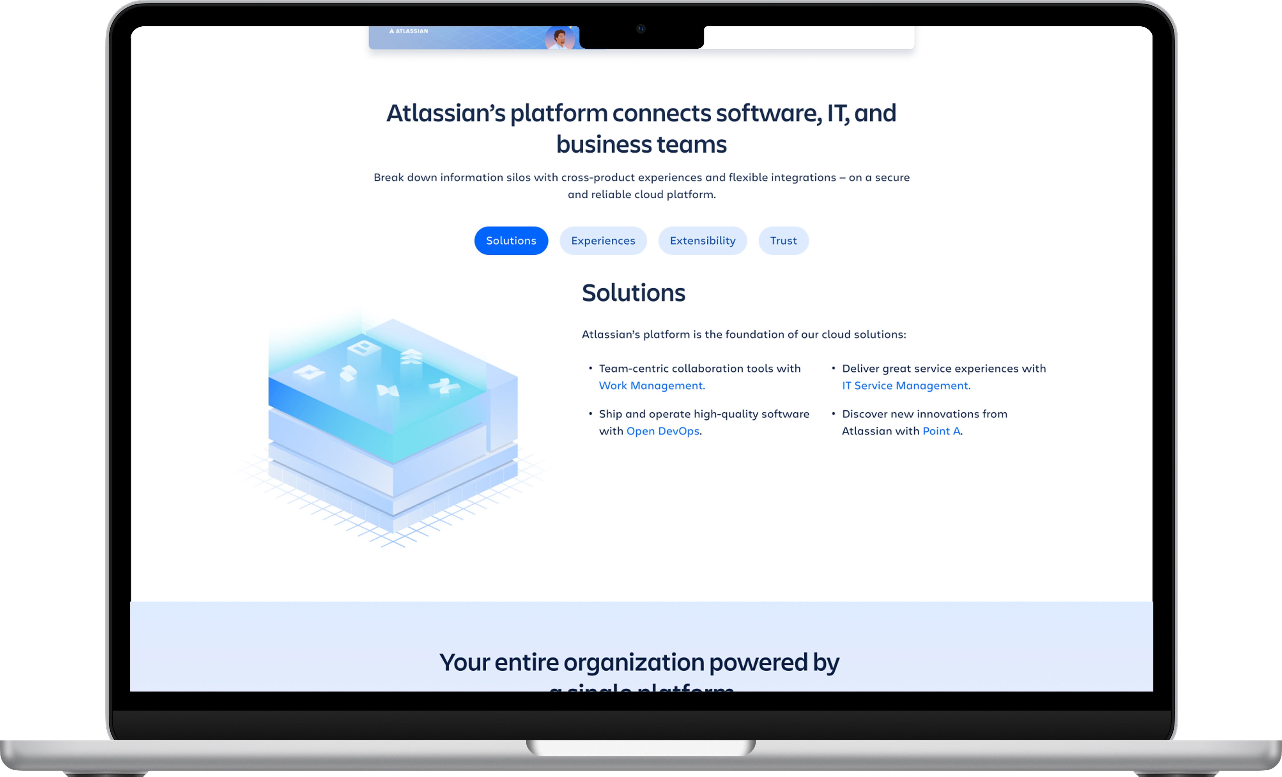
⛔️ 63% of users scrolled down and clicked or hovered over the graphic—but it added no value. The static, unclear diagram failed to explain how platform worked or highlight its benefits.

RE-DESIGN/ Show platform value
Solution:
✔️Layered Visuals: Broke platform into infrastructure, features, and integrations, so users could grasp how it all fits.✔️Concise Microcopy: Worked with content and added bite-sized explanations for each layer—what it does, why it matters, and how it maps to real workflows.
✔️Modular Interactivity: Made each segment clickable, letting users dive into related product pages based on their interests. This shift transformed a passive image into an engaging guide that empowers users to explore and understand Atlassian Platform.
INITIAL DESIGN
⛔️ The old design lacked trust signals—proof points, or validation—so buyers hesitated. In user interviews, I learned that industry-specific success stories were critical: prospects needed to see peers like them succeeding before they’d move forward.

RE-DESIGN/ Social proof
to build trust + awarenessSolution:
✔️Teamed up with Product Marketing to showcase top customer logos up front, instantly signaling credibility.✔️Added a horizontal carousel of industry-specific case studies, surfacing multiple success stories without lengthening the page.
✔️Embedded direct enterprise quotes calling out real-world ROI, making outcomes feel tangible and relatable.

INITIAL DESIGN
⛔️ Before the redesign, the landing and all child pages featured only one CTA—the newsletter signup.
⛔️ Despite an OKR to drive enterprise growth, users were frustrated by the lack of a clear “Contact Sales” option—undermining conversion opportunities.
RE-DESIGN/ Define Clear Actions
Solution:
✔️Persistent CTAs at top & bottom of key pages.✔️Bold, accessible buttons replacing text links.
✔️Heatmap-driven cta placement at natural pause points.
✔️Short demo videos embedded for extra context.
INITIAL DESIGN
⛔️ 63% of users scrolled down and clicked or hovered over the graphic—but it added no value. The static, unclear diagram failed to explain how platform worked or highlight its benefits.
RE-DESIGN/ Show platform value
Solution:
✔️Layered Visuals: Broke platform into infrastructure, features, and integrations, so users could grasp how it all fits.✔️Concise Microcopy: Worked with content and added bite-sized explanations for each layer—what it does, why it matters, and how it maps to real workflows.
✔️Modular Interactivity: Made each segment clickable, letting users dive into related product pages based on their interests. This shift transformed a passive image into an engaging guide that empowers users to explore and understand Atlassian Platform.
INITIAL DESIGN
⛔️ The old design lacked trust signals—proof points, or validation—so buyers hesitated. In user interviews, I learned that industry-specific success stories were critical: prospects needed to see peers like them succeeding before they’d move forward.
RE-DESIGN/ Social proof
to build trust + awarenessSolution:
✔️Teamed up with Product Marketing to showcase top customer logos up front, instantly signaling credibility.✔️Added a horizontal carousel of industry-specific case studies, surfacing multiple success stories without lengthening the page.
✔️Embedded direct enterprise quotes calling out real-world ROI, making outcomes feel tangible and relatable.
INITIAL DESIGN
⛔️ Before the redesign, the landing and all child pages featured only one CTA—the newsletter signup.
⛔️ Despite an OKR to drive enterprise growth, users were frustrated by the lack of a clear “Contact Sales” option—undermining conversion opportunities.
RE-DESIGN/ Define Clear Actions
Solution:
✔️Persistent CTAs at top & bottom of key pages.✔️Bold, accessible buttons replacing text links.
✔️Heatmap-driven cta placement at natural pause points.
✔️Short demo videos embedded for extra context.
INITIAL DESIGN
⛔️ 63% of users scrolled down and clicked or hovered over the graphic—but it added no value. The static, unclear diagram failed to explain how platform worked or highlight its benefits.
RE-DESIGN/ Show platform value
Solution:
✔️Layered Visuals: Broke platform into infrastructure, features, and integrations, so users could grasp how it all fits.✔️Concise Microcopy: Worked with content and added bite-sized explanations for each layer—what it does, why it matters, and how it maps to real workflows.
✔️Modular Interactivity: Made each segment clickable, letting users dive into related product pages based on their interests. This shift transformed a passive image into an engaging guide that empowers users to explore and understand Atlassian Platform.
INITIAL DESIGN
⛔️ The old design lacked trust signals—proof points, or validation—so buyers hesitated. In user interviews, I learned that industry-specific success stories were critical: prospects needed to see peers like them succeeding before they’d move forward.
RE-DESIGN/ Social proof
to build trust + awarenessSolution:
✔️Teamed up with Product Marketing to showcase top customer logos up front, instantly signaling credibility.✔️Added a horizontal carousel of industry-specific case studies, surfacing multiple success stories without lengthening the page.
✔️Embedded direct enterprise quotes calling out real-world ROI, making outcomes feel tangible and relatable.
Research
Redesign Results
Informing decision-making: Research provides data and evidence to support design decisions. It helps designers make informed choices about layout, color schemes, typography, and other design elements, leading to more effective and user-friendly websites
Research
Redesign Results
Informing decision-making: Research provides data and evidence to support design decisions. It helps designers make informed choices about layout, color schemes, typography, and other design elements, leading to more effective and user-friendly websites

Define clear actions
Simplified user navigation with well-placed CTAs, featuring “Contact Sales” at both the top and bottom for maximum visibility.

Show platform value
Incorporated interactive visuals within pillar-based containers, creating a clear and engaging space for video content.

Modular, Scalable Design
Designed scalable interactive elements, allowing future updates without an entire page overhaul.

Show platform value
Refreshed the original diagram by adding interactive elements, new creative details, and descriptive copy.

Show platform value
Enhanced SEO by adding descriptive copy to each element, improving user comprehension.

Show platform value
Broke down each element to unlock strategic cross-linking possibilities.
Define clear actions
Simplified user navigation with well-placed CTAs, featuring “Contact Sales” at both the top and bottom for maximum visibility.
Show platform value
Incorporated interactive visuals within pillar-based containers, creating a clear and engaging space for video content.
Modular, Scalable Design
Designed scalable interactive elements, allowing future updates without an entire page overhaul.
Show platform value
Refreshed the original diagram by adding interactive elements, new creative details, and descriptive copy.
Show platform value
Enhanced SEO by adding descriptive copy to each element, improving user comprehension.
Show platform value
Broke down each element to unlock strategic cross-linking possibilities.
More Works More Works
More Works More Works


bildkritik
Go Back To Top
bildkritik
Go Back To Top